FMP | Reflection

The big project of the year, this has easily taken the most time and effort out of me to get to the finished product, but I am incredibly pleased with the outcome. While certain printed parts of the book detracted from the presentation – thanks to the printers that failed to bind my book correctly, or even follow my directions – the overall outcome leaves for an incredible visual barrage of red that instantly draws interest, along with the beautiful trace and acetate prints that I had sent to me.

Behind the glory of the finished project was me, toiling away over many weeks, but allowed for me to create a piece that I am pleased with. The constant development on the book over weeks caused a burnout, and so I did concentrate on other elements of the project so that I wasn’t purely focused on the book. This allowed time for the creation of the poster designs and thoughts on how to present them in the final show, and the choice for the fluorescent red paper was a strong choice that played out well in the end, especially when it could be paired with a cover of the same colour for the book.

The separate aspects of the final pieces that I wanted to show in the exhibition felt all over the place when I was spread on doing design, screen printing, and experimentation on non-standard printing papers, like the trace and acetate. As the show drew closer and closer, the constant change between book design and screen print design felt like the perfect balance, like I was working to an optimum pace, using my time wisely to complete all aspects of my work.

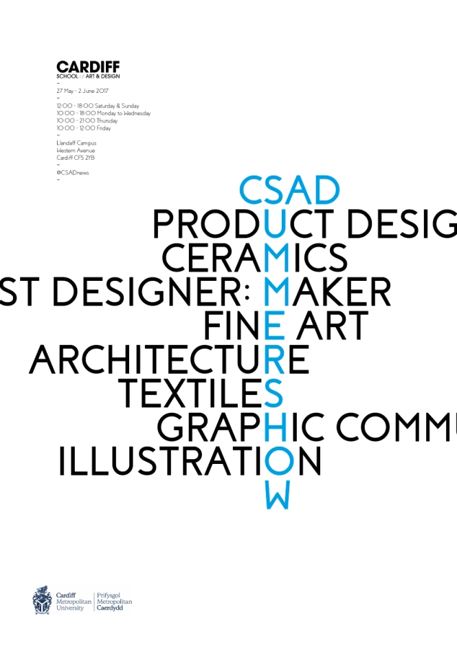
The screen prints were one of the more troublesome aspects of the printing process, purely due to finding somewhere with the time I had left that could print onto such light weight paper for the exposure of the silk screen. The prints I will use for my deadline are 4 tiled A3 pages that come together to create a B2 image, hopefully still displaying the desired effect when the large trace posters are layered over the top.

The book itself is wonderful, but due to issues with the print company I used, pages are starting to fall out, the book was originally bound incorrectly, and pages are misaligned too. While the book looks decent enough to present for marking, I refuse to show a piece of work that is falling apart. Both this book and the poster will be redone for the Summer Show in a few weeks’ time, but for now these will suffice for displaying my idea.

Elements that I would improve upon in this book would be the actual written material inside the book, as while I feel I did a decent job at conveying my idea in written form, a trained writer or journalist would have been able to convey the idea much better than I could have. On top of this, I would also like to extend the length to include more content, though time only allows for a set amount of things to be done, and I am happy with the amount of content present within this book in the given timeframe.

COMP | Reflection

Have a multitude of tasks to work on while developing my competition entry was one of the more difficult tasks I had undertaken this year. While it was not required that I enter the work into the D&AD competition, I felt that it would be a waste if I didn’t try to improve my original idea and push to have it sent in for the competition.

The changes that I made from the original end of the brief as required by my tutors were major, and while the concepts that I conceived at that point were still very much a part of this project, they had been reformed to become part of the MUBI Passport. Along with these was the glue that stuck that all together, the renovated MUBI Passport application allowed me to gain new skills into developing for small screens as well as testing out new software from the Adobe suite.

I felt that the app made the overall idea very strong, allowing for all the original ideas to come together as well as being a conduit to introduce new ideas. One such idea, as mentioned in previous posts, was the Landmarks idea, that only came about from the app being constructed; phones nowadays have so many extra features, it is hard to know what can be used without having a technological expert on hand, and I am sure that if such knowledge was available to me during this brief, I could have possibly made the app much more engaging through extra features. However, the app worked as it was needed, and extra features may have weighed it down and took away from the balance.

If I was to continue developing this, or redo certain parts, I would try to redevelop the advert aspects of my design as they felt a somewhat different to the what the app was offering in style. While I did like the style that was created for these posters, they would have worked much better as a different campaign that undertook a similar visual theme.

Analysing Me – The Final Major Project

Time to put on the big boy shoes because this is the final stepping stone to the end of a beginning. From what I’ve gathered, the Final Major Project is about showing what I can do within an area that I find interesting, that I love.

From the beginning I have always been invested in typography as a medium, though over time in seemed to have less of an impact on me personally and was more about creating work that used the correct font, and soon other areas of design wormed their way into my mind, piquing my interest in photography and screen-printing, as well as other areas outside of design such as ceramics, and art installations.

I have lately become more interested in typography once again as I used to, and is something I want to include in my FMP, but along with other interests that I have also followed in my years at university.


Over the last few months I have made an effort to making sure that ideas are as big as possible, perhaps so big that they cannot feasibly be made, but they can always be scaled down or trimmed; creating a concept is the hardest part of the design, so being as adventurous as possible allows for more ideas to flow.

When given this much freedom on a single project it does make me feel overwhelmed in the beginning, but I realise that getting on with the project, forcing out ideas, allows for progress and destroys this overwhelming feeling and allows for continuous ideas to come out.


With this short analysis of myself, I have begun to understand what I am interested in within the world of art and design; I chose to not limit myself to the discipline I have decided upon, but to be broad and challenge myself with what can be used to effectively communicate to an audience. I have decided to look at the idea of Form vs. Function and where graphic design sits in this intersection.

BIG IDEA | Reflection

Working to such a short deadline on such a large spec project can always seem tedious, but it gives me the deadline to work to and help me achieve a goal at the end of the work. This project especially pushed the boundaries in allowing me to learn boundaries to work within as well as how hard to push myself to make the project work.

My concepts explored themes that I hadn’t previously worked with, especially the second idea that I developed that was more akin to a fine art piece than a piece of graphic communication. This pushing of discipline to its maximum made me realise that graphic design isn’t about what you learn from the classroom and experience around purely graphic design, but also the multitude of other experiences that you have with people and concepts in other disciplines, which is this case bordered on fine art.

The concept itself worked well, in my mind, at delivering the meaning of holism as I viewed it, and allowed other people to experience it through interaction, a continuing theme across work that I have done this year. I think the jump to involving the audience in the design was important on conveying the meaning which explicitly implies the involvement of everything the idea comes into contact with. If I worked more on the project, I would have created a range of these characterising sets, to build a space that was purely about holism.

BIG IDEA | The Big Idea

The Big Idea was all about being as adventurous as possible with a word chosen from a selection of 20; I conducted research and development around the word Holistic, with the outcome becoming an interpretation of what I believed the word and my work should convey.


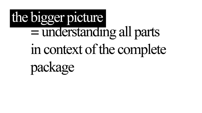
Holism is explained as the parts of a whole being intimately interconnected where you can only reference them in terms of the whole. A simple interpretation of this idea is often described as “Seeing the Bigger Picture”, being able to see how these parts engage with one another to allow the whole to work.

This could be compared to the idea of wisdom and intelligence; you can pertain the knowledge of knowing certain parts can be part of a whole (wisdom), but to know how they work with each other to become a complete item, you must understand how each engages with others and how that affects other parts (intelligence).

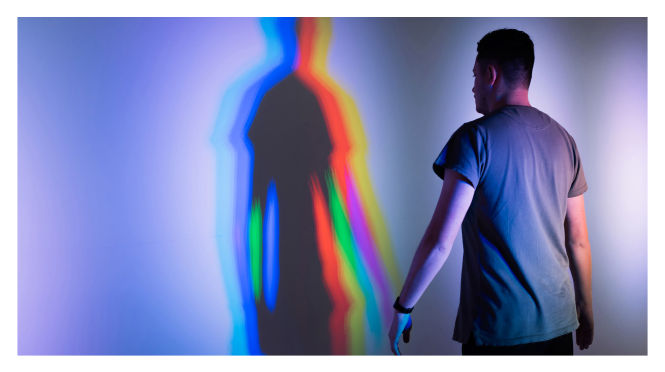
A quote by John Muir explains the complexity with simplicity: “When we try to pick out anything by itself we find it hitched to everything else in the Universe”. To show this I want show this concept through a three-dimensional installation that requires multiple strands to create the piece along with the audience becoming an integral piece of the design

Bigger Picture 1 Bigger Picture 2 Research 1

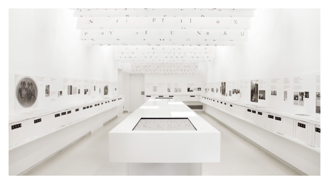
Bilbio-Tec, created by Marina Soto, Júlia Beard, and Jofre Sanfeliu

Bilbio-Tec, created by Marina Soto, Júlia Beard, and Jofre Sanfeliu

Heineken Glass Room created by Gabriel Finotti, Solenn Robic, Hick Duarte, Marcelo Gerab, and Jonatas Pontes

Heineken Glass Room created by Gabriel Finotti, Solenn Robic, Hick Duarte, Marcelo Gerab, and Jonatas Pontes

Closed Worlds, created by Natasha Jen and Pentagram

Closed Worlds, created by Natasha Jen and Pentagram


Concept 1 – Characterising

Take a single character or symbol and explore its past and present uses in the world. This would be shown using an explosion of information with an origin point of the character of choice.

| Creates a link between the conception of the character and the present uses of this character

| Embodies the very idea of Holism by allowing you to understand how everything works in conjunction

| Requires the user to engage to understand, further pushing the idea of holistic upon the audience

Concept


Concept 2 – Essence

An exploration of the senses, this would be an installation piece that shuts off the audience from the world by removing one sense at a time until there is nothing; at this point each sense would be put into effect one at a time before showing them altogether. This would establish how taking everything into account with one another is an important component of design

| Feels more alike to a fine art piece compared to a piece of design. It is an experience

| Conveys Holism through experience instead of through feeding knowledge


Of these two concepts, the more adventurous one is the latter which would require a lot of time and money investment to create a piece that would work at a level that was intended. The first concept is one that I have decide to continue with as it allows for more experimentation through the development process as well as being an easier concept to develop with the time and money that I have available to me.

PENGUIN | Reflection

Ideally, I would have liked to spend more time on this project, but the time scale given was such a short time that it only allowed for a small number of iterations before we presented them. The interim critique helped to fix some of the minor issues I had with the original design, specific aspects were picked out for being out-of-place or eluding to some other kind of story. These excellent points allowed me to fix and develop my work into a more refined piece.

The style I decided to follow for the design I put forward was more of a minimalistic approach, something a bit different to how I usually like to work; I felt that it suited the story in terms of its complex simplicity, and though it was perhaps a style that wouldn’t stand out too much on shelfs for people to pay attention to it, it gave off a vibe of dark adult nature that showed the coldness of the killers on the front cover.

PDP – Year 3

To create a dissertation on a chosen subject you must first understand what is most important to yourself, especially due to how much time and effort you will be investing into this piece of writing. From my understanding, I wanted to pay close attention to the events of the world and how my design practise influences and can be influenced by past, current and future events and the population of a whole country. Throughout my studies I have engaged in different fields of design ranging from my own practise of Graphic Design to Ceramics and have travelled to multiple countries for extended periods, such as China and South Korea, locations that hold different views on etiquette, actions and the world, influencing its society in a totally different manner to what I am used to in the UK.

Through my dissertation I have begun to understand what parts of my chosen field I enjoy more thoroughly along with what I want to specialise in as the years go on, with advertising taking more of a backseat on a journey that will allow me to be more dynamic with my style, allowing me to create work that is not just visually stunning but also mentally stimulating, allowing for consideration of joining functionality and purpose with a ‘why not?’ mentality.

Over the years I have participated in constellation I always tried to reason with myself the impact it would have on my field and my life; topic areas seemed to be directed more towards the art side rather than the design side. It wasn’t until later into my second year that I began to perceive how useful these topics were when creating work for the public space, a designers natural setting, where the rules of the world begin to work on your piece and unexpected developments begin to occur. Expanding further, my endeavours into the field of ceramics helped to broaden my awareness of the impact of small changes to a material, porting this idea back into my work by making small changes to designs that could have been declared complete, though of course our work in never finished. When I brought back everything I have learnt from constellation and field into my subject area work I could create much more engaging designs and was also able to describe what I was aiming to achieve with a piece much more clearly than before.

My explorations of countries, practises, materials and research has brought me to and understanding of myself to a degree, progressing towards understanding what I want to pursue as I draw closer to the fog that obscures the path ahead; my research into the effects of advertising on the audience has only made me evaluate work much more thoroughly, both my own and others, helping me to create multiple pieces that hopefully go beyond what I would previously have could. I would love to continue to explore the world so that I can develop relationships with people all over the world, learning new and engaging with cultures to help inform my work with new techniques, allowing me to combine different types of methods together to create more intriguing and creative work.

From a creative view, I would love to develop my work into how the audience engages with it, enticing them in to touch and feel rather than purely participating through just looking at the work I have created; I would like to create a spanning campaign that is understood through viewing or collecting multiple instalments of my work to create a bigger piece that has a bigger meaning. I want to create pieces of work that have multiple layers of meaning that change each time a piece of the puzzle is collected, though is still able to inform the audience of something whether you have just one piece or every part of the design. In terms of specific skills, I’d like to engage with different tools at a higher level so that I can contribute my ideas to my work as I envisioned them originally.

If I was to continue my research I would delve into first-hand research of the effects of advertising on the populace and how the effects change the outcome of people’s lives and the world. From what I have researched for my dissertation I haven’t be able to delve much into specific effects of advertising on children as there is not enough research for everything that I needed, such as multiple regions, cultural and religious upbringing effects as examples. To expand on this I would need research on a large volume of children with different backgrounds and upbringings so that I could view the specific effects of children of advertising based in different regions on different groups of background and upbringings, allowing for a more in-depth analysis of the effects on children; this would allow designers to take this into account when creating their work so that it had less negative effects, and hopefully a more neutral or positive one.

I believe that the process of learning a field doesn’t stop when you step of the path of tutor-powered education and doesn’t ever stop for as long as you continue to explore the ideas that you work with, but there are splits in the path which allow for continued exploration into new disciplines that also lead back to the place that you left, giving you more power to develop on what you have worked with previously, and my dissertation has most certainly helped me to no just understand about the specific subject I was writing on, but also the field that I am working in as well as myself as an artist, giving me the knowledge to know what I want to create.


COMP | A Final Helping Hand

Halfway there, and the project feels like it lacks substance, or a way to bring everything together into a single entity. The idea is to create some sort of immersive project that would allow users to experience their favourite movies from their local city, bringing together actors, film crew and fans together to talk about everything they want to about film. Applied to this concept was a secondary idea of a collection, using the idea of a passport to show the places you had ‘traveled’ to by watching movies from across the world, one of the specialities of MUBI.

To bring forth my ideas I created a short 30 second advert that encompasses the idea I am trying to design for, through from the use of well-known and lesser-known films along with a specifically picked soundtrack that would evoke the feeling of euphoria that is often felt when watching a movie that can be closely related to.

During my presentation I explained the concept to a group of peers along with tutors and was given feedback similar to what I was feeling, but with a way to solve the problem; to bring everything together I should create an umbrella brand, bringing everything I had created under the MUBI Passport title, unifying the separate elements to make them feel connected.

The video was disowned due it not performing as it should have, not depicting any of the core values of MUBI with specific context. While this was annoying thanks to the time spent making the video, it was just a bump in the road to creating a better product.

Further development would require time to bring everything together under the umbrella brand, and I felt that to do this I would need to redesign everything I had done so far to create a constant feel across all the different elements. This would be the final helping hand I would receive on the project by tutors, so everything afterwards and towards the D&AD deadline would need to be done by myself and help from my peers.

COMP | Interim Presentation

So after all the research and fun times gathering ideas to go forwards with, it was down to the presentation to see whether this was something that should be continued with, or perhaps changed.

So as I’ve put in my previous post, I’m focusing on the outdoor immersion on potential consumers of the product by getting them involved; with a small push from tutors I decided to focus on a treasure hunt design, getting people to involved themselves through social media while going about their daily routine within the city. Major props, characters and locations would be shown from films around the town/city and using the hashtag #NowShowing people whould be able to link tigether their ideas to find out what the films were and finally who the director was.

Kubrick Films

Doing this would create a more prolific online persona as well as getting people interested in what MUBI have to offer; as time went by there would be less known cult or classic movies so that people would puzzle out the films with help from other film gurus via social networking as well as using the MUBI site to watch the films.

Getting critique back from tutors and peers alike, I was told that it missed the element of the curator as part of the campaign which I agreed with, as well as the fact that it would take a lot of effort to get people involved with the campaign if it is so spread out. I think it’s time to explore how to develop this idea a bit more to give it some flourish