This year has been a whirlwind of adventure that won’t stop, I mean I’m going off to China in a couple days to do an internship but enough of that, let’s have a fireside chat about the magnificence of the year that has been and gone.
Following the early start in a new house with new housemates, it’s safe to say that the branding project was a great opening to the year with the introduction of how to go about branding in a real world environment. Though there wasn’t the depth of realism that you would have once you entered the real world, it gave us an insight into the world of design when looking at briefs from companies, the questioning of clients on specifics of the project, and the deliverables that could be argued for and against depending on what you, the designer, thought would be needed by the client. This was probably the most fun project of the year with a relatively neat concept that kept you grounded in the manner of you had some basic rules as well as tutorials to make sure you didn’t stray away from the main focus of creating a brand identity. While I felt I had a great time on the project, I poorly managed my time and spent too much time on creating one or two concepts in full depth instead of having a full set of 3 developed concepts and this was a major downside to my project. Pretty obvious to see that if I was to do it again, I would fix my time management and spread it equally over the 3 concepts.
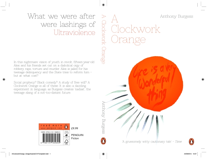
After what seemed like a rather long first project came an incredibly quick second project for the penguin book cover competition. With chosen book being the classic A Clockwork Orange, there needed to be a great amount of originality as this cover has been done hundreds of times over the years since its first publish. A quick project like this was a good jolt to arrange my poor time management from the previous project and gave birth to what I thought was a strongly designed piece for the cover, though I think it would have been great if there was more time to create a second concept for the project as well, and while that was possible as the deadline was a couple months from the uni project deadline, it didn’t feel like a necessity to do.
After a long break between two field projects and the winter holidays, we came back to a new project that focused on design work for a charity or non-profit organisation to raise awareness for it in a newly self-developed campaign. This was one of the harder projects that required more of a thought process compared to the others due to the fact it was a lot more open, even if we were in contact with out chosen organisation (which I was unfortunately not). I had a great deal of fun with this project, though factors such as there already being a fully developed brand identity caused it to be a bit more of a pain for me personally as I prefer to take on brand identity projects, but these factors allowed me to explore what could be done if you are imaginative with the current branding of the company.
And finally comes the self-branding project with the creation of our CVs and Portfolios, and this was easily the hardest project of the year; putting a load of information about yourself is fine, but when it comes to doing the same in a business aspect, you need to show yourself as a great character, not just your average joe. Developing a style is another difficult aspect that requires thought, though less so mainly due to subtle aspects will most likely not be picked up. I can honestly say this project taught me some important information that could be transferred to when branding for either other people or for companies as I go on into the future.
